Investing
See the Unknown History Behind 16 Auto Company Logos

Published:
Last Updated:

With the abundance of car commercials racing through the screens, you’re probably getting whiplash from all the auto company logos you see on a regular basis. But ever wonder what inspired these designs? And why have some have become iconic and engraved in consumer culture?
Well, we took a deep dive into the history of some of the most popular auto companies to unearth their logos’ histories. So here’s what we found.
Enjoy the ride.
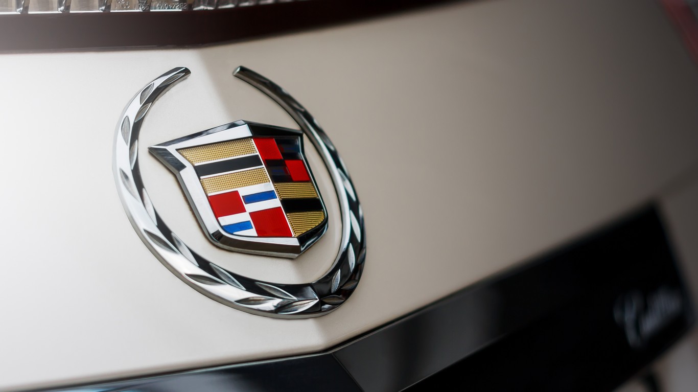
You may be most familiar with the current wreath and crest logo that’s predominately black, gold, and red. But if you’ve been around the track for a while, you may have noticed it went through several changes.
In fact, it has been redesigned almost 30 times over the past century. The current one has been around since the early 2000s.
The multi-colored Cadillac crest was inspired by the French adventurer Antoine de la Mothe, Sieur de Cadillac’s coat of arms. He’s known for founding the Motor City, Detroit.
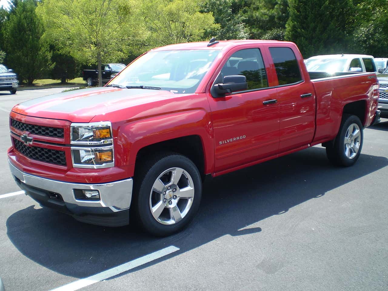
Built like a Chevy, the Chevrolet’s bow-tie logo first emerged in 1913 and is shrouded in mystery and theories. And the company says the authors of the Chevrolet Story birthed the most popular theory of the logo’s origins.
Here goes. While in Paris in 1908, world traveler and Chevrolet co-founder William C. Durant was amazed by a design on the hotel wallpaper. Legend has it, he tore a piece and brought it back to the states, where it served as the blueprint for the Chevy bow-tie logo.
Makes you wonder if the person who designed that wallpaper would know their work would inspire one of the most recognizable automobile logos in the world – even centuries later.
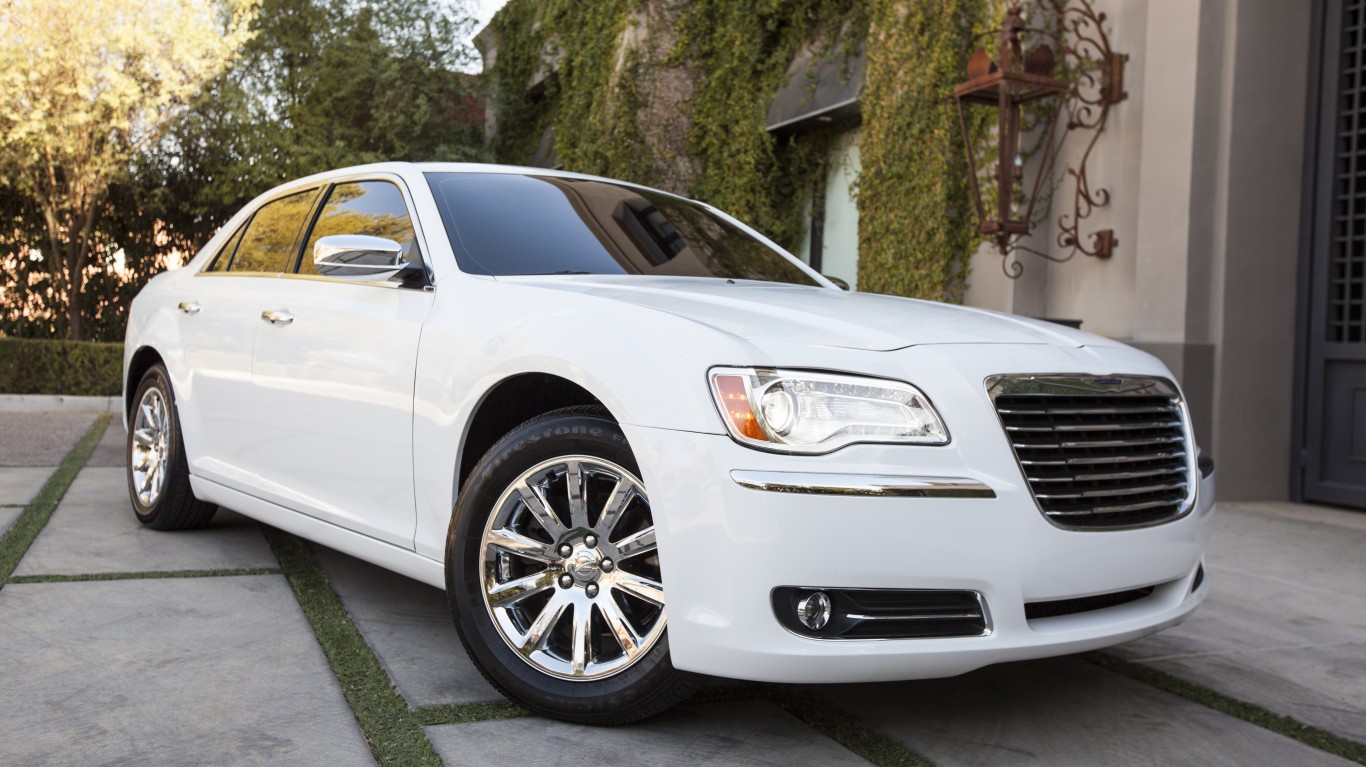
The recognizable Silver Wings and the shield with the wax seal logo of Chrysler wasn’t always with the brand. In fact, the company’s logo has gone through several changes over the past four decades.
Most recently in 2023, the company took a minimalist approach and remade the logo to the one you see today with the wings drawn as flat black lines. It may not be as flashy as its older versions, which at one point even featured a lion. So why the change?
This is what Chrysler had to say.
“Chrysler is a company which is not afraid of experimenting with its visual identity design. The American automaker has had a dozen badges created for it throughout the years. The latest redesign, held by the brand in 2009, was supposed to elevate the look of the company to a new level and to reflect the progressive and modern approach of Chrysler.”
Merry Chrysler to those who observe.

The Citroen logo with its two arrows points back to 1919. Founder André Citroën took inspiration from the herringbone-shaped Polish metal gear system. Andre discovered it while visiting family in Poland.
He then bought the patent and used this system in factories across France. The rest, as they say, is history.

The famous capital “H” for the Honda logo tracks its roots back to 1948, when the company was founded by Soichiro Honda in Tokyo. And the “H” simply represents his family name. Nonetheless, it remains one of the most notable car brand logos in the world.
And Simpsons fans may remember the popular ‘90s episode when Superintendent Chalmers finds the “H” is missing on his Accord.
“Ohhh, that’s how people know it’s a Honda! What’s the point of having a Honda if you can’t show it off?”
But since inception, the “H” logo has undergone several slight changes with the current version being used since 2000. And it is set to undergo another update in 2026. But rest assured, the “H” remains.
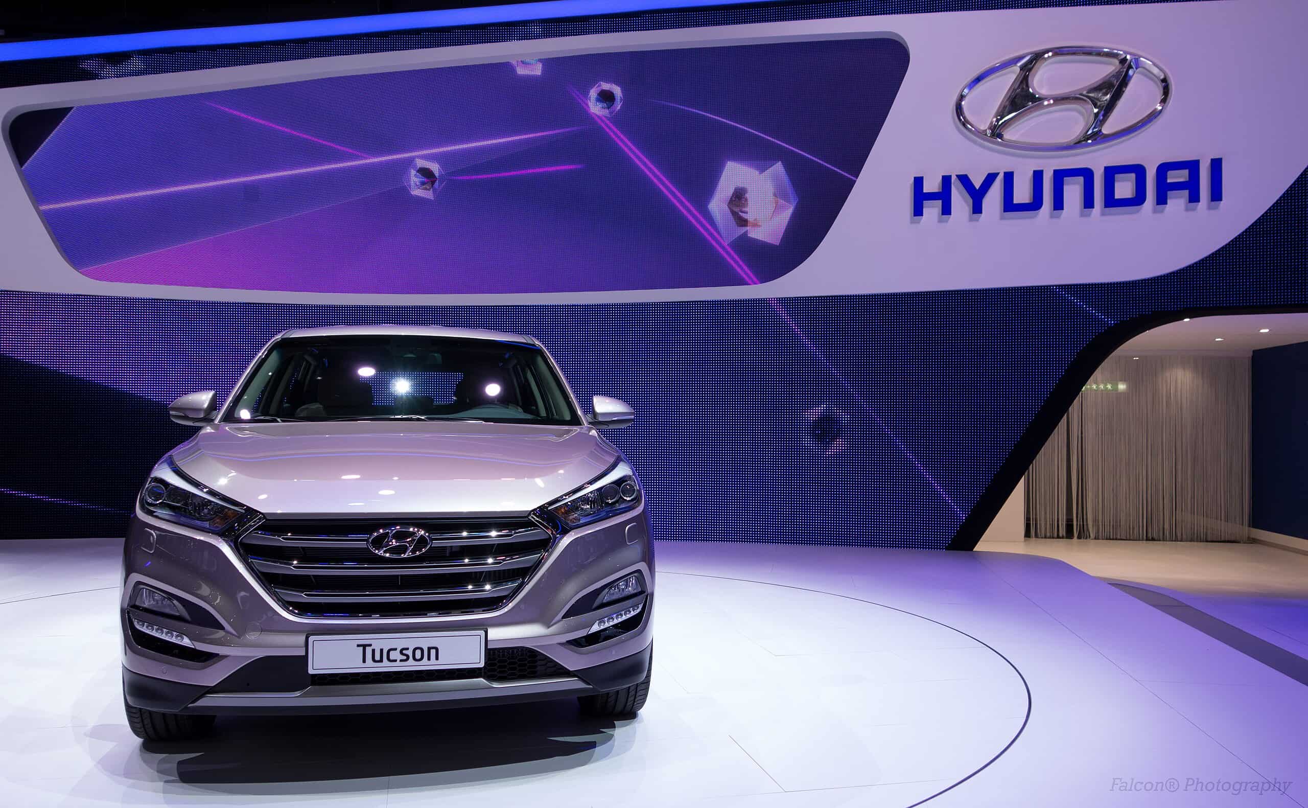
Here’s another “H” for you. Or is it? To the naked eye, the Hyundai logo seems like an “H” symbol. But if you look closer, there’s a visual there. It’s actually supposed to depict silhouettes of two people shaking hands. It portrays a handshake between a company representative and a happy customer to symbolize the brand’s commitment to customer satisfaction.
Moreover, “Hyundai” in English translates to “modernity.” – another main component of the company’s principles.
One variation or another of the logo has existed since 1967, when the company was founded by a Korean entrepreneur Chung Ju Yung.

The Infinity logo was introduced in 1987 when Nissan finalized the name for its luxury vehicle division. The logo represents two lines leading to the infinite horizon.
The design is actually based on the ‘Lemniscate’ – the symbol for infinity used by early mathematicians.
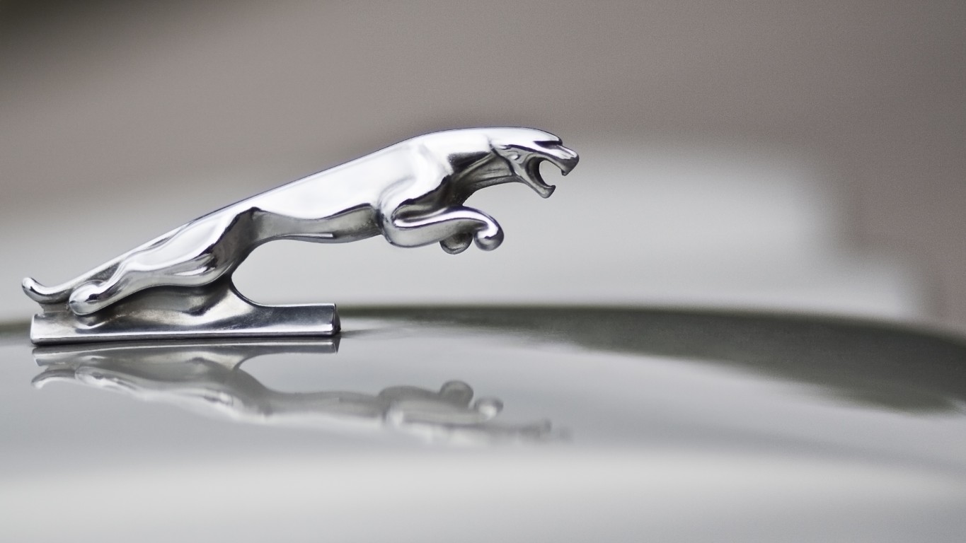
The iconic leaping Jaguar logo that many associate with the company actually didn’t roar into the scene until 1982. However, the company once existed as The Swallow Sidecar Company founded in 1922. The logo featured a circle with the company name with wings on either side. Other noteworthy renditions of the logo featured an “SS” logo with flat wings on either side between 1935 and 1945. But the company quickly changed lanes on that after World War II, since it very clearly echoed the S.S. symbol of Nazi Germany.
But after the ‘80s and the introduction of the Jaguar mascot, the logo went through few changes. It remains with its majestic leaping jaguar to represent the luxury brand.

The famous Lincoln Star has been in commission since 1964. But the logo isn’t really a star. It’s a compass representing the four corners of the world and the company’s desire to drive its luxury brand across the globe.
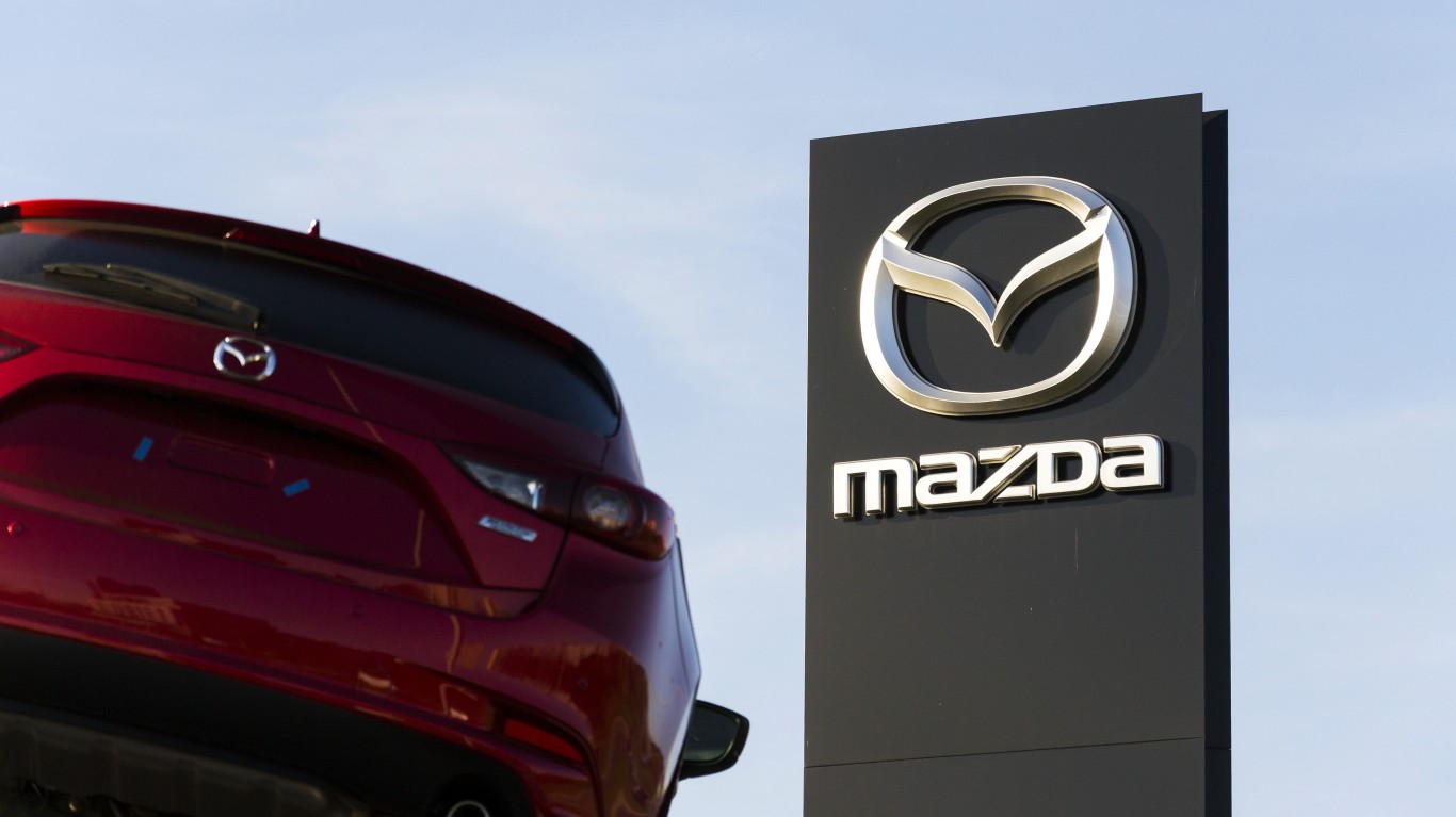
The first Mazda logo was introduced in 1934 and has since gone through several changes. The one we see today has been around since 1997. It represents creativity and the potential for growth. In fact, the “M” which appears to be a “V” or set of wings reflects the company’s mission to soar into the future and the “M” represents its mission to bring mobility to all.
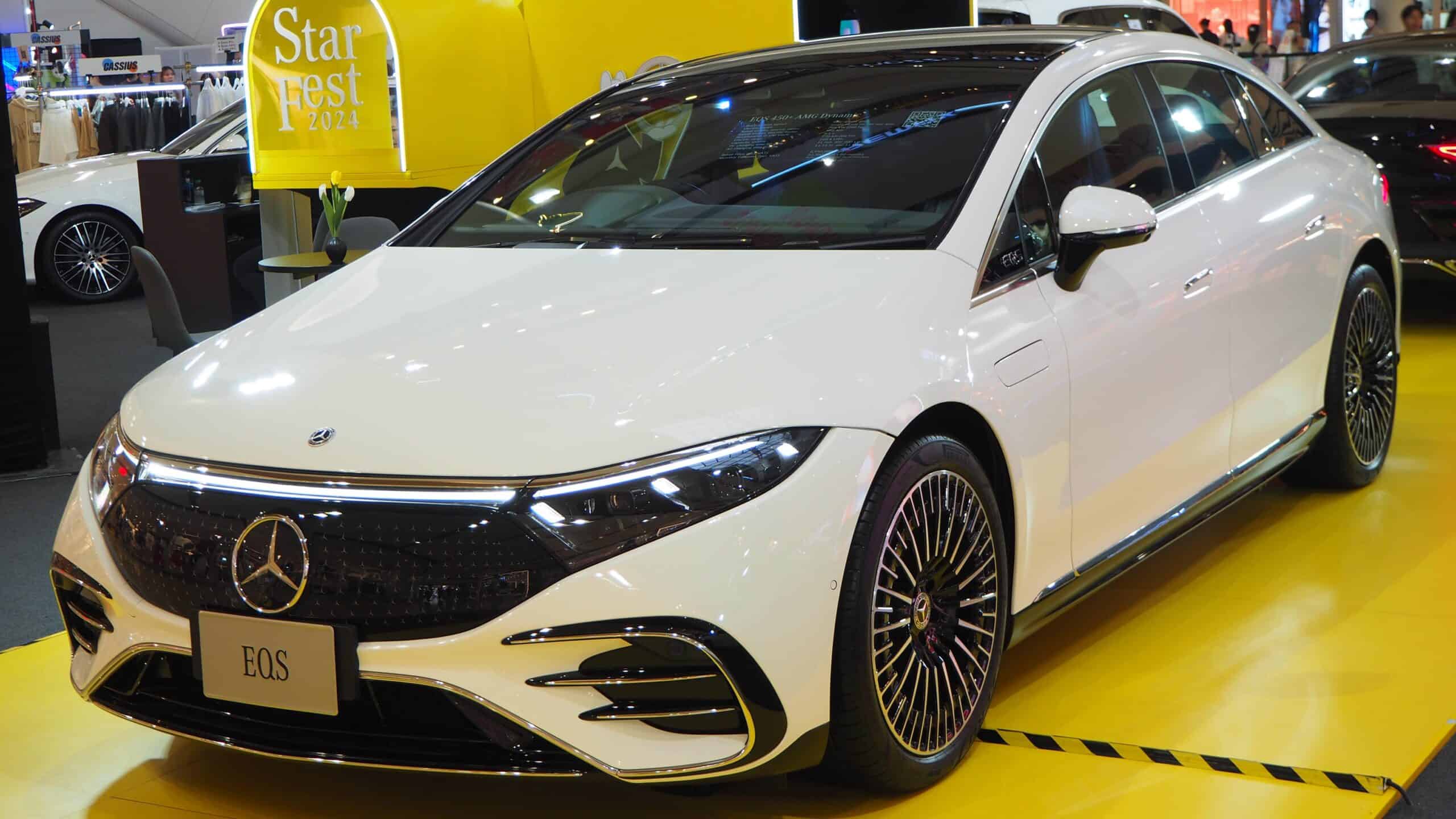
The iconic three-pointed star Mercedes logo first made its debut in 1909. The Story goes that founder Gottlieb Daimler’s sons got inspiration for the star from a postcard they got from their father in 1872. Since then, the three-pointed star has gone through a few style changes – at some points featuring a wreath. The original star logo was blue before becoming silver in 1934.
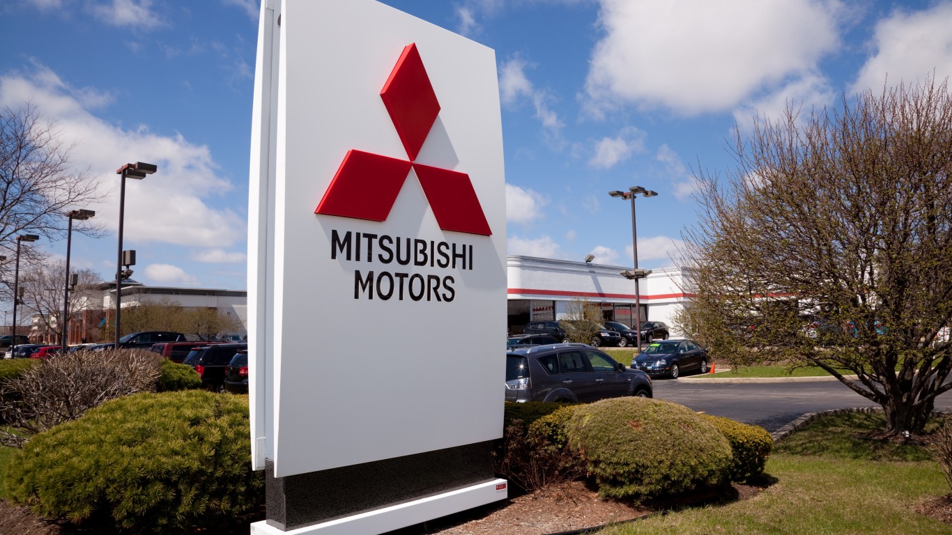
The three-diamond Mitsubishi logo traces its roots back to the 1870s when it existed as a shipping company called Tsukumo Shokai. The company used a triangular water chestnut icon on its ships’ flags. It was inspired by the three-layer chestnut family crest of Yataro Iwasaki and the three-leaved oak family crest of the Yamanouchi family.
The red three-diamond Mitsubishi logo made its way onto the road in 1985. But it was only used for overseas advertising outside its native Japan. But in 2014, Japan adopted the logo into their branding as well.
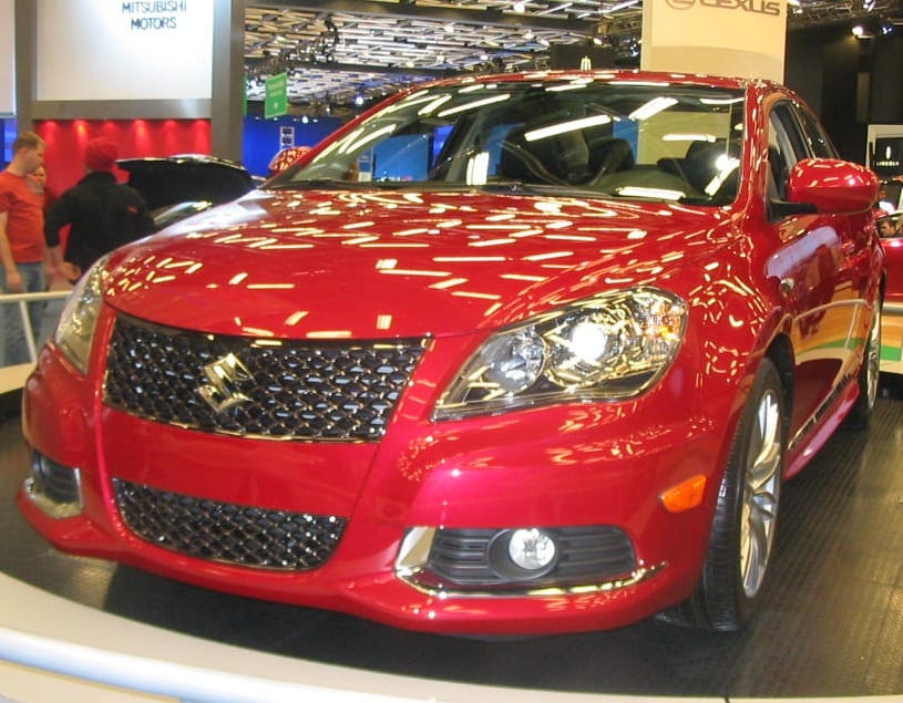
Although the company was founded in 1909, Suzuki didn’t roll out its memorable “S” logo until 1958, after it was chosen from a pool of more than 300 candidates. The winner behind the “S” logo was Masamichi Tezeni, a student at the Tokyo University of the Arts.
Going through little changes, the simple “S” has remained a staple for the brand. The current logo’s bright red hue is meant to represent passion, energy, and drive. Some say it’s reminiscent of Japanese culture and its sharp edges conjure images of the mighty Samurais and their swords.
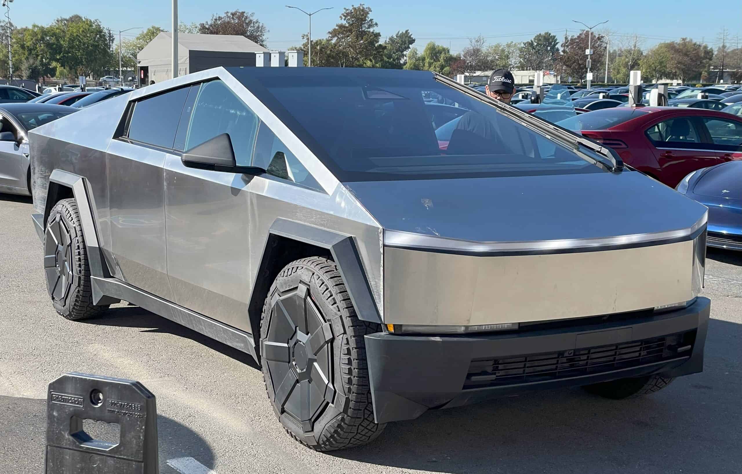
The Tesla logo today is perhaps as recognizable as the company’s CEO Elon Musk. The first rendition of the EV giant’s logo took charge in 2003. It appeared as the classic “T” within a shield that contained the company name in a custom Tesla font.
Why the T? Before he took over Twitter and rebranded it to “X,” Musk explained on the social media website.
“Similar to SpaceX, the T is like a cross section of an electric motor, just as the X is like a rocket trajectory.”
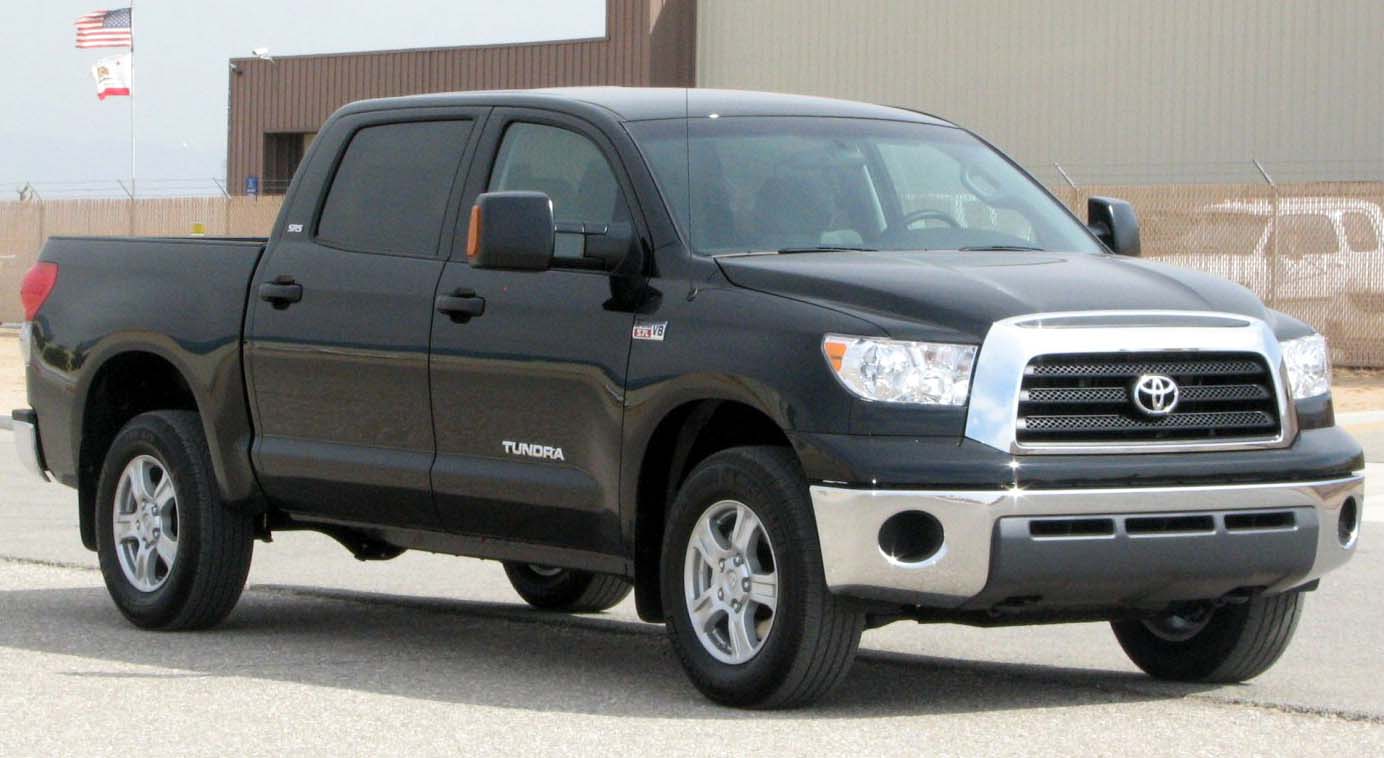
The memorable “T” logo built with ovals actually wasn’t introduced until after Toyota had already been around for 50 years. In fact, it marked its five-decade anniversary.
According to the company, the three ovals in the Toyota logo are linked in a horizontally symmetrical layout, which allows it to be recognizable head-on and from a rear-view mirror. Toyota says the inner circles represent the heart of the customer and the company, while the outer oval stands for the world embracing Toyota.

The Volkswagen logo traces its roots back to 1939, when the auto manufacturer was established as a state-owned company by Nazi Germany. In fact, the first rendition of the “VW” logo was centered in a cog wheel surrounded by a swastika-like background.
The logo lost its Nazi symbolism moving forward and went through a few design changes, but the “VW” remained front and center. The current version has been on the road since 2019 and resembles a more sleek and futuristic take to represent the brand’s launch of electric vehicles.
Credit card companies are pulling out all the stops, with the issuers are offering insane travel rewards and perks.
We’re talking huge sign-up bonuses, points on every purchase, and benefits like lounge access, travel credits, and free hotel nights. For travelers, these rewards can add up to thousands of dollars in flights, upgrades, and luxury experiences every year.
It’s like getting paid to travel — and it’s available to qualified borrowers who know where to look.
We’ve rounded up some of the best travel credit cards on the market. Click here to see the list. Don’t miss these offers — they won’t be this good forever.
Thank you for reading! Have some feedback for us?
Contact the 24/7 Wall St. editorial team.