When you walk into a retail store for the first time, whether a Wal-Mart Stores Inc. (NYSE: WMT) supercenter or Barry’s Bike Shop, chances are your first impression will have a significant role in a decision to buy something. If you came in to buy a certain item, maybe you’ll end up buying something else as well — or a more expensive (and higher profit) item instead. If you feel like a fly trapped in a spider’s web, the feeling is not unwarranted.
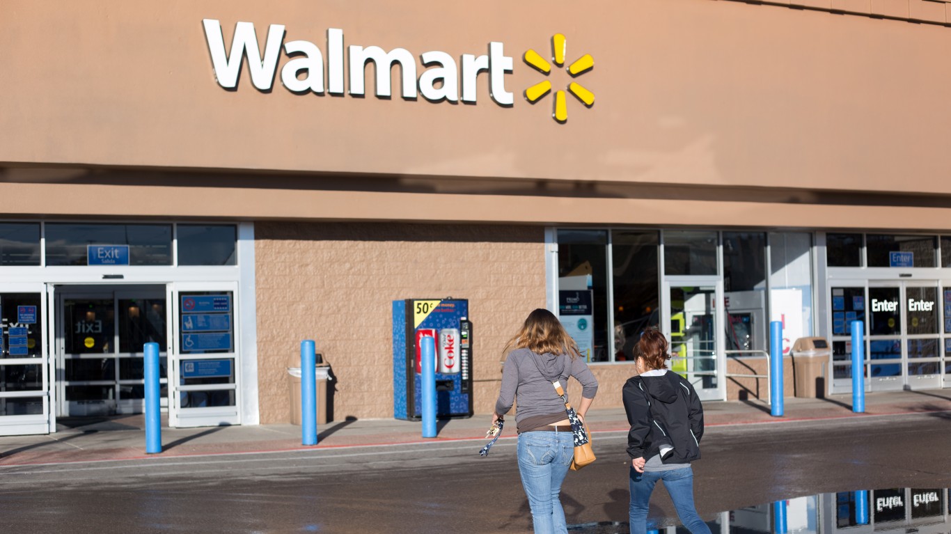
Even before you walk in, the store’s “curb appeal” is working on you. Signage colors, window displays and an appealing entryway that is clean and uncluttered affect your willingness to spend time and money at this particular store. Smart retailers know all this and do their best to deliver the appearance of a store worth your patronage.
Analyzing shopper behavior is a growth industry, whether the shopping is done online or in a brick-and-mortar store. Online shopping has built-in data collection methods that can provide the seller with a blizzard of data on what shoppers are doing on a website and what they are buying or not buying. Brick-and-mortar retail does not have the same advantage, but it has been around long enough that virtually every retailer implements a few tricks to help separate shoppers from their money.
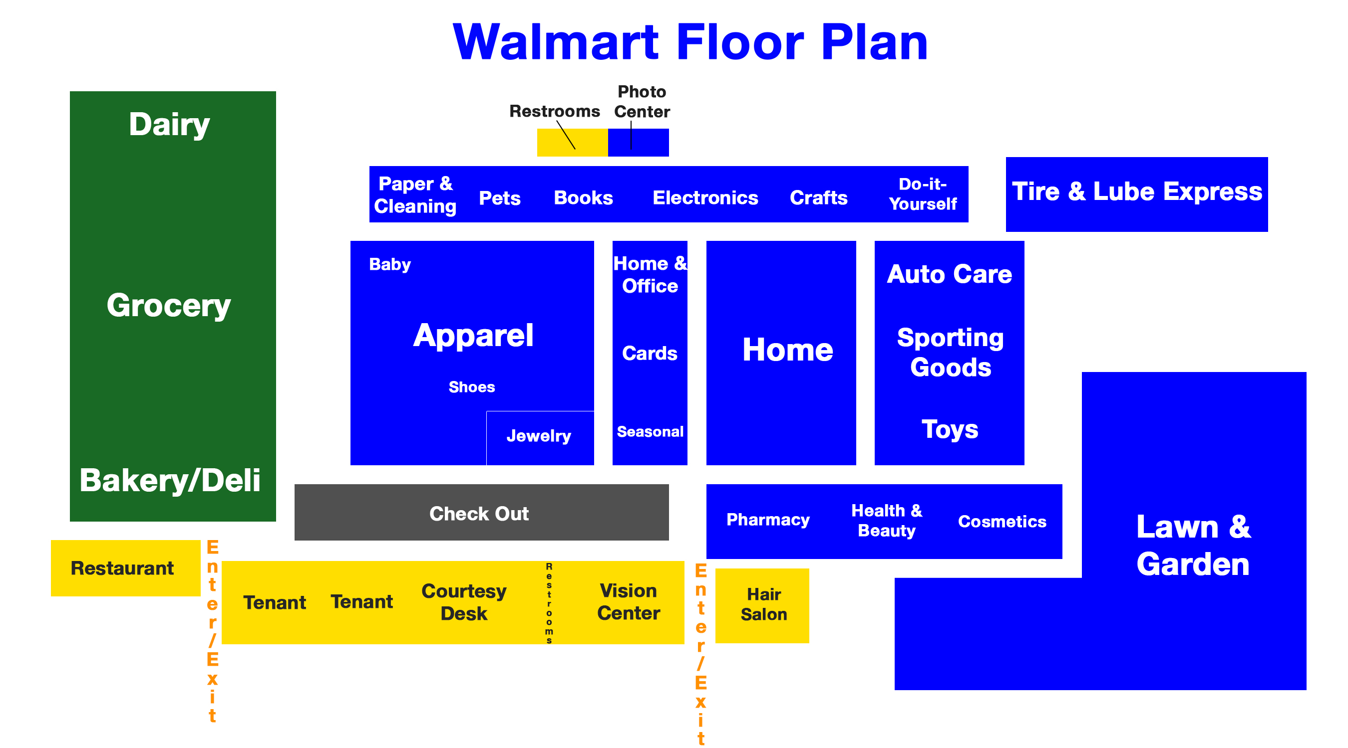
The following map shows a typical floor plan for a Wal-Mart U.S. supercenter. It is not the only floor layout the company uses, either in the United States or in foreign countries.
Here are some tactics Wal-Mart and other successful retailers use to entice shoppers or persuade them to buy more.
- Impulse areas. Typically at the cash registers and, also typically, stuffed with candy and other treats that shoppers can buy as a reward for a shopping job well done. Or to quiet demanding children.
- Store-in-a-store. This may not actually mean a branded store-within-a-store but a portion of the floor space that has been decorated differently to make it stand out. Special lighting along with wood floors and shelving send an upscale message and consumers will pay more to be part of that message. Wal-Mart’s latest upgrades to its electronics section are an example.
- Endcaps. The ends of long rows of shelving (called gondolas) were originally used to promote special pricing offers. By adding signage that made the endcaps look like discounted offers, retailers can now place full-price items on these endcaps and expect to see higher sales.
- Eye (and buy) level. Most shoppers don’t want to bend down to examine an item nor do they want to have to reach way over their heads to get something. The items that stores promote the most are somewhere between eye level and waist level. Brands often compensate supermarkets with placement fees for these most favored positions.
- Traffic builders. Putting everyday items like milk and bread all the way at the back of the store exposes shoppers to more potential purchases. It also tends to make them mad. It’s a trade-off.
- Action Alley. This is the power aisle, the most central area of the store and one where it is typical to see one-off promotions or seasonal items. The impression on shoppers is that more good deals await as they get deeper into the store.
- Front of store. In a Wal-Mart supercenter this is typically the location for the customer service desk along with a restaurant, a vision-care center and maybe a local shop or two that rent space from the store. The idea is to give shoppers a feeling of a small-shop downtown shopping district.
- Signpost brands. These are the nationally advertised brands that virtually everyone at least knows if not uses. Campbell’s soups, Coca-Cola, Heinz ketchup — all these indicate to shoppers what else they’ll find on nearby shelves. Shoppers also expect to find store-brands that cost less right next to the big brands.
- Overall environment. Primarily this means the overall look of the store and clearly identifying sale items and locations. Wal-Mart has been remarkably consistent with its “rollback” and other pricing signage. Shoppers looking for bargains know by now just exactly what to look for.
- Product range. A typical supermarket stocks about 80,000 products. A typical household uses about 300 products. A typical Wal-Mart supercenter stocks more than 142,000 different items. Do shoppers really need to be able to choose between 10 brands of bottled water?
- Encouraging shopper traffic to move to the store’s best advantage. Most shoppers travel around the perimeter of a store, and counter-clockwise movement is the way most shoppers prefer to traverse through a store. Research done in 2008 shows that shoppers who move counter-clockwise spend on average $2 more per trip to the supermarket. That’s not a lot, but then retail is not exactly a high-margin business and every extra dollar is welcome.
- Using color and smells to create an impression. It’s no accident that Wal-Mart puts its bakery at the front of the store. The smell of freshly baking bread is warm and inviting. Similarly, a display of fresh vegetables in all their glorious colors implies a healthy and fresh environment.
- Making it hard to find things. If shoppers cannot easily locate the item they came into the store to buy, they typically begin to look at other items they had no intention of buying and occasionally that turns into a sale. A Wal-Mart supercenter is so large that the store doesn’t even really have to try very hard to do this.
Are You Ahead, or Behind on Retirement?
If you’re one of the over 4 Million Americans set to retire this year, you may want to pay attention. Many people have worked their whole lives preparing to retire without ever knowing the answer to the most important question: am I ahead, or behind on my goals?
Don’t make the same mistake. It’s an easy question to answer. A quick conversation with a financial advisor can help you unpack your savings, spending, and goals for your money. With Zoe Financial’s free matching tool, you can connect with trusted financial advisors in minutes.
Why wait? Click here to get started today!
Thank you for reading! Have some feedback for us?
Contact the 24/7 Wall St. editorial team.


